HYPOTHESIS-DRIVEN DESIGN
The Overview
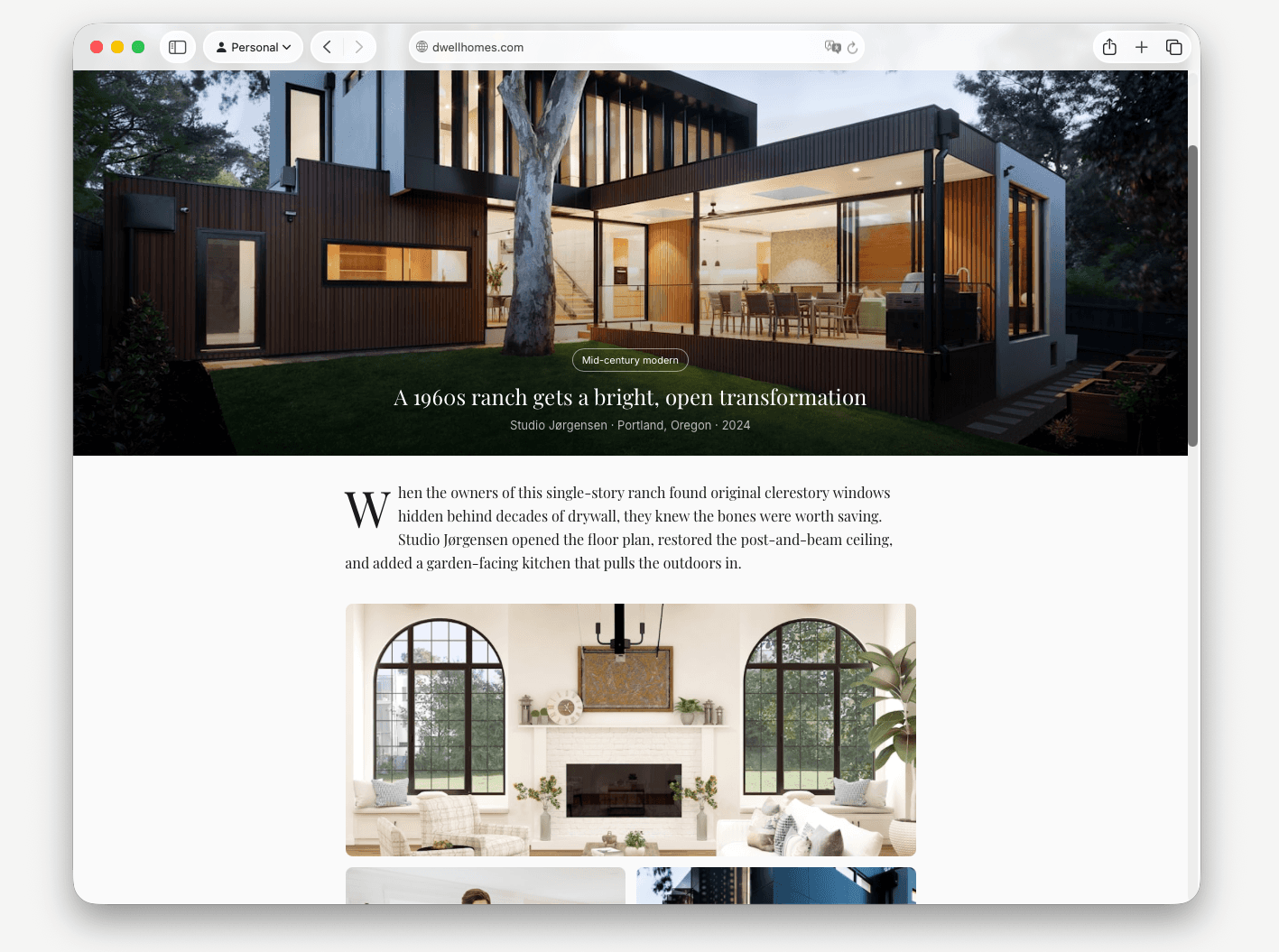
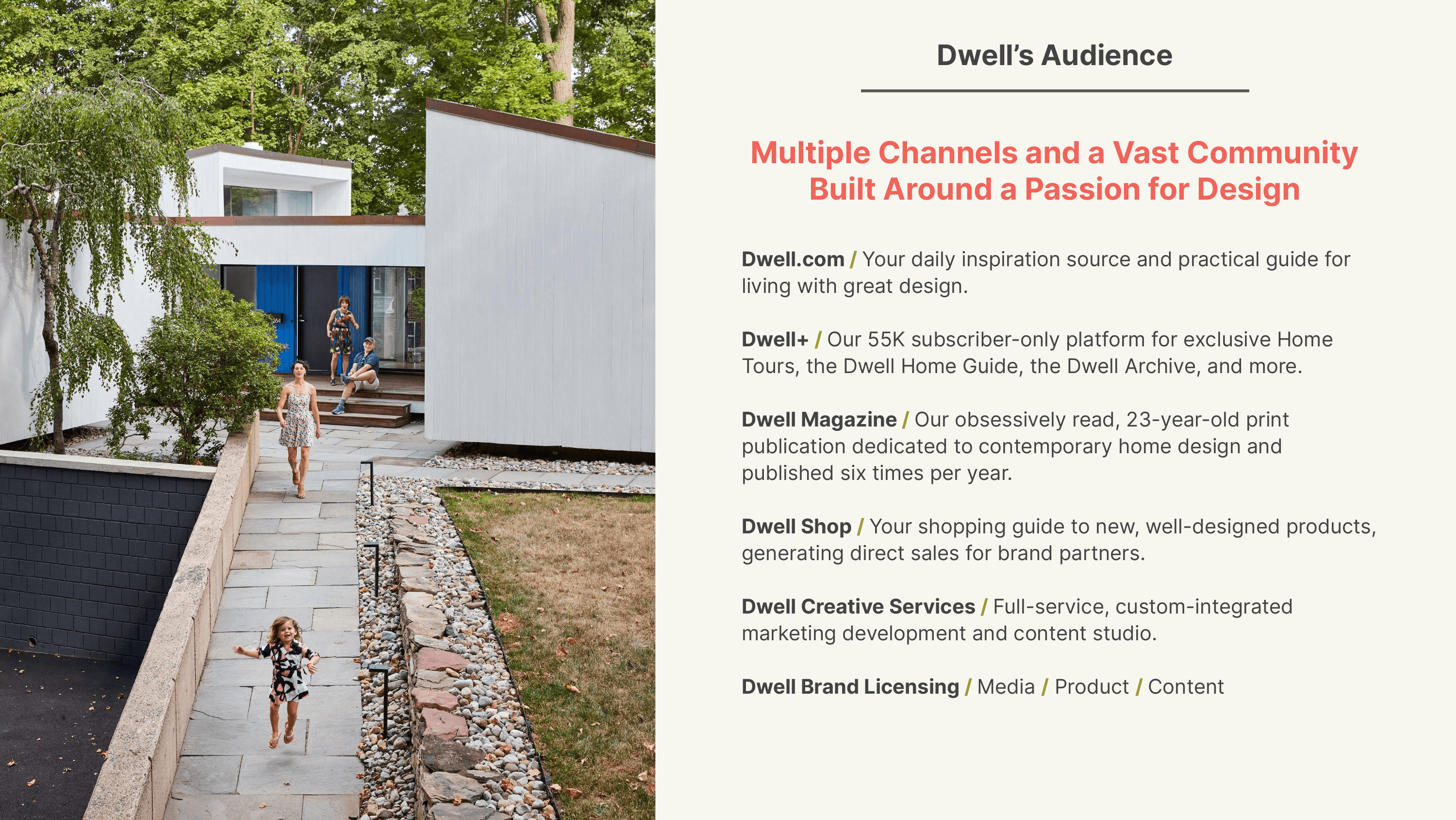
Dwell proposed launching a real estate platform for renters, buyers, and agents — complete with AI search and AR/VR tours. I was given the PRFAQ and two years of audience data. Through analysis of Dwell's 2024 and 2025 media kits, I reframed the product from a home search platform into an aesthetic-driven renovation discovery experience — then prototyped it solo using Lovable.dev
The Problem
The PRFAQ identified renters, buyers, and agents as the target users, and AI search with AR/VR as the core technology. It positioned Dwell Homes as a real estate marketplace differentiated by design taste.
Dwell clearly had brand permission to enter this space. But the PRFAQ's user, use case, and technology assumptions hadn't been tested against the audience Dwell actually reaches. The risk wasn't shipping the wrong feature — it was building for the wrong person.


The brief didn't survive the data
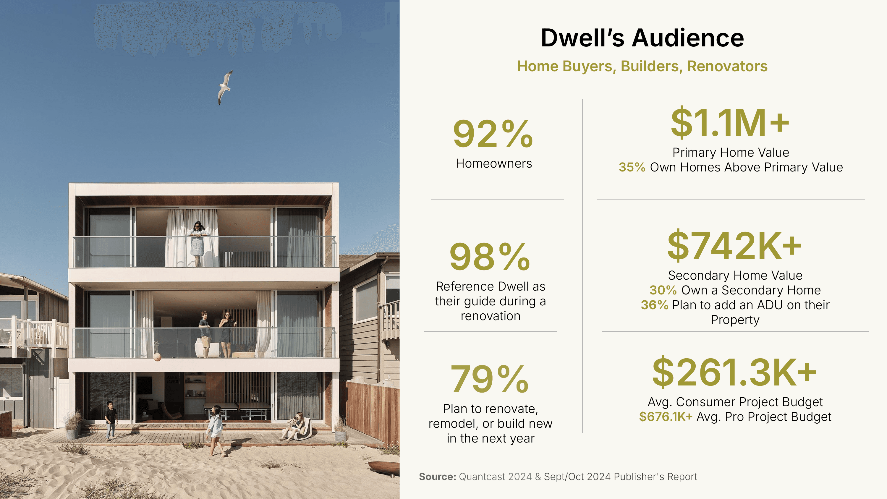
The PRFAQ's thesis was right — this audience wants spaces that match their aesthetic sensibility. The entry point was wrong. They aren't searching for homes. They're transforming the ones they own. Year-over-year the data confirmed it: HHI rose from $178K to $222K, home values and ADU interest appeared in the 2025 kit for the first time, pro budgets hit $676K.

Three directions explored
Directions 2+3 deferred as v2/V3 — evidence-based, not arbitrary
Direction 1 won because it matched existing behavior, preserved the editorial mental model trust was built on, and was testable solo without marketplace supply or MLS data.
What I built
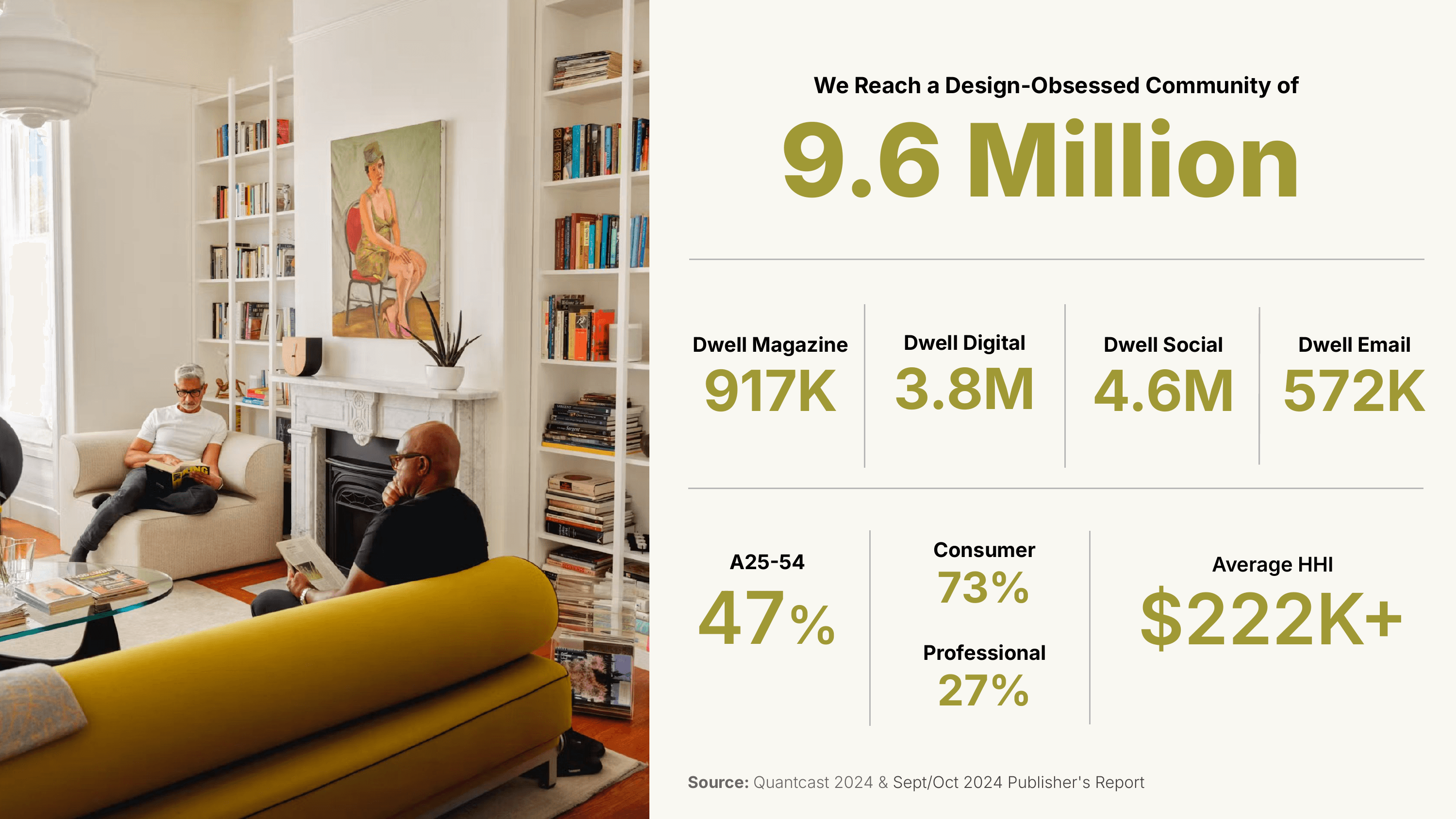
One bet: design language is a more natural organizing principle for this audience than rooms or specs. The evidence — 80% of content consumption is organized around aesthetic visions (50% Home Design + 30% Shopping & Guides), and the audience has 25 years of editorial training in thinking this way.
The trust dynamic shaped every interaction. This audience's mental model is "Dwell is an editor with taste" — not "Dwell is an algorithm with data." The onboarding feels like the start of a conversation with a curator. The feed has a point of view before the user touches anything. Filtering gives users agency over discovery while the system maintains editorial posture. Each choice preserves the trust asset that 98% reference and 89% act on.
Testing within the direction
Two interaction-level hypotheses, tested as A/B variations in the prototype.
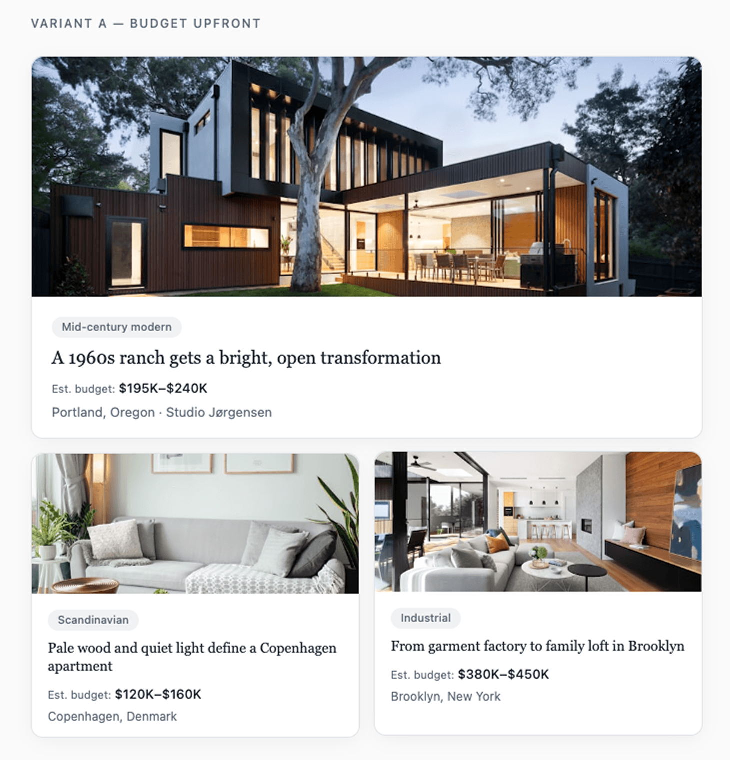
Test 1: Budget transparency — When should budget context appear?
Bet: Upfront budget accelerates confidence for $261K decisions.
Risk: Early price anchoring narrows exploration for an audience where 86% value design quality over price. Budget Breakdown's
Test 2: Feed hierarchy — Which dimension organizes discovery?
Bet: Style-first matches how content is consumed — Home Tours present whole-home narratives, 50% of content is Home Design.
Counter-bet: 79% are planning specific projects with room-shaped needs
Both tests probe the same PAIR question: which information hierarchy gives users the most productive agency over their discovery path?
Test 1 is specific to this audience. Budget Breakdown is one of Dwell's most distinctive franchises (37% pro interest), so budget context has proven editorial pull. But showing it upfront on every card could anchor users on cost before they've explored the design space — a real tension when 86% say they value quality over price.
Test 2 directly validates the prototype's central bet. If project-type-first wins, it doesn't kill the aesthetic approach — it means design language works better as refinement than as primary structure.
What I cut

The AR/VR cut is the clearest example of technology-first versus user-first thinking. The PRFAQ framed it as a differentiator. The data showed the audience already engages deeply with static photography. What they needed was steering capability over discovery, not deeper immersion in viewing.